Nutriwise Case Study
Timeline:
12 months
completed in Dec 2023
My Role:
UX Researcher
UX/UI Designer
Completed as a solo student project for CareerFoundry
Tutor - Nandini Bhamidipati
Mentor - Kathleen Tucker
Tools used:
Figma
Optimal Sort
Lyssna (formerly Usability Hub)
Google Forms

The Problem
The challenge lies in the inability to locate and connect with a nutritionist online for live sessions, from anywhere, at a preferred time and in a cost effective manner.
Current market challenges that create unnecessary constraints in pursuit of health and wellness:
Most web platforms offer algorithm based plans without the unique opportunity for 1-on-1 audio/video sessions with a certified nutritionist
Limitations of relying on insurance coverage
Relying on traditional in-office visits that entail significant costs, lack of preferred appointment slots and prolonged in-office wait times
The Solution
A responsive web app offering tailored plans resulting from individual video/audio sessions with a nutritionist of choice
In this short video, I walk through the process of finding a nutritionist and booking a session
Competitive Analysis
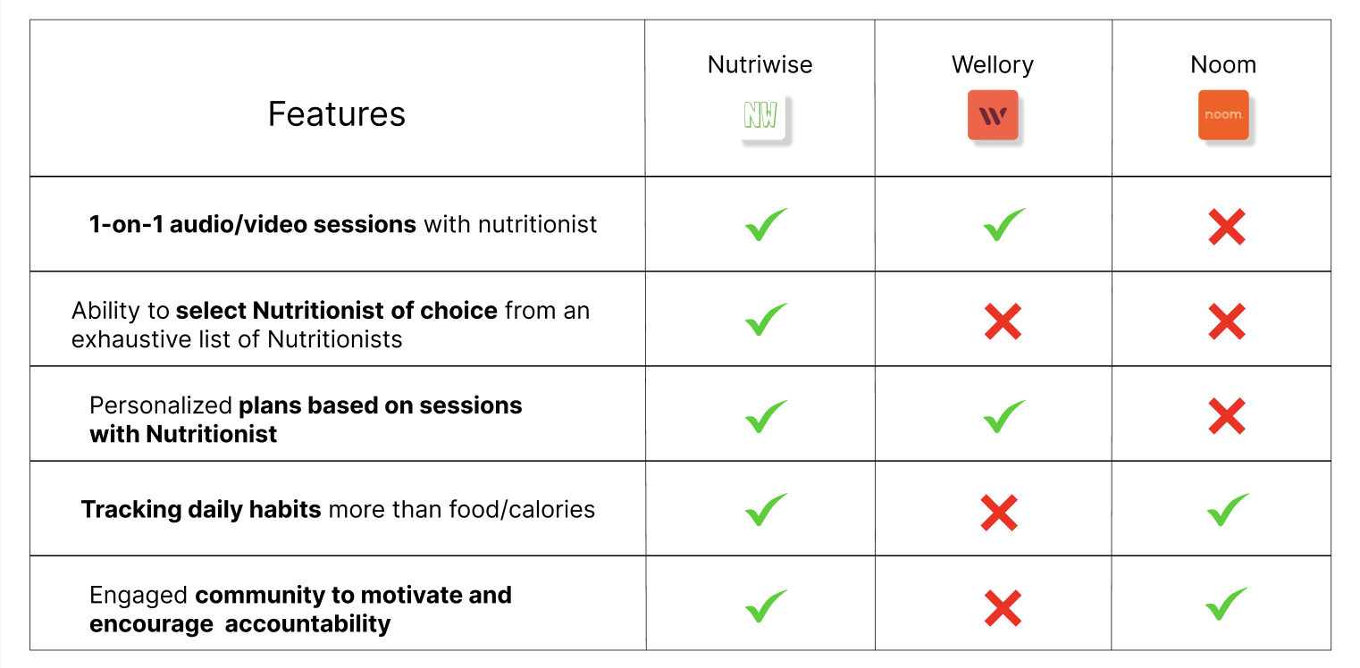
No competitor currently offers personalized and cost-effective 1-on-1 audio/video sessions with a nutritionist of choice
I reviewed 6 apps and conducted a detailed analysis of two notable competitors
I prepared a feature comparison chart as well as detailed SWOT analysis. This discovery presented an opportunity to identify the market gap and subsequently integrate all the commonly sought functionalities into a single unified app
UX analysis for Wellory:
Wellory provides an uncluttered and straightforward welcome page and profile set up. The features are easy to find and navigate. The color schemes are pleasant and seem to add value to the overall concept and experience.There is no way around the initial detailed onboarding, which may seem overbearing for users who wish to only get an idea of the services prior to signing up.
Layout:
The features are well highlighted and the onboarding process is clear and detailed. Once signed up, users get to view the profiles of three coaches for selection followed by payment page. The downside is unless payment is made there is no provision to experience what Wellory has to offer
Navigation:
The streamlined user experience is guided by essential tabs, including a hamburger menu and bottom tabs in the desktop version. The app version seamlessly transitions users between pages. A limitation is the need to choose from three presented coaches rather than selecting from a list. Navigation is enhanced with professional visuals and a pleasing UI. FAQs cover common topics. Users upload daily meal pictures and receive coach messages. Wellory offers a tempting collection of free-to-view recipes, potentially inspiring both current and prospective users.
Compatibility:
Wellory is available for iOS, Android and desktop.
User Research
Following market research I conducted surveys and in-person interviews to augment and deepen my research efforts.
Surveys
I conducted the survey using Google Forms, and received 20 responses which set a foundation before proceeding to interviews.
User Interviews
I conducted in-person interviews with 3 participants by building upon the findings of the survey and creating a script focusing on user experiences, attitudes and behaviors, pain points and desired features they seek.
Main Insights
Post interviews I organized the main insights with affinity mapping and came with three themes which set me on the path to understand the needs, pain points and motivations of my potential users clearly.
The insights that directly correlate to the prime feature of 1-on-1 sessions with the nutritionist that Nutriwise offers are highlighted in green
Drawing directly from these insights, Nutriwise's design was shaped, resulting in the development of its key features
Onboarding pages
User Personas
The conception phase began with creating inclusive, diverse and relatable user personas, user journeys and task analysis. Subsequently I progressed to formulate primary task flows and the mobile sitemap. These foundational steps were pivotal in designing the core features for Nutriwise.
View these in a horizontal scroll through below
Sitemap
I conducted a card sort to gain further insights on the mental models of my target users in navigating through the app. Here is the analysis:
The card sort exercise highlighted important navigation and hierarchical aspects for the mobile sitemap from potential users' perspective. It was insightful to know 100% of the participants put Health Profile under the My account label. The reason I had it under the More label was to avoid overloading My account as users may access this page on a daily basis. Next 50% participants wanted to see Calendar function under More page though I believe it would be intuitive to have it under Home making it easy for users to compare day to day progress. It seems like a good idea to move Goals to My account page and Groups to Chat page and make My groups a subcategory under Community thus making the navigation intuitive. After analyzing and chatting with participants I realized that most found the Search label ambiguous and would rather prefer a separate Expert page. Following the results from card sort these are my plans for revised sitemap-
Move Health profile to My account
Relocate My Groups as a subcategory under Community page
Move Goals under My account
Add Help function under More page
Rename the page Search to Expert
Link Payment details(My account) and Upgrade Plan(More)
Revised mobile sitemap using discoveries and insights gathered from competitor analyses, user research, personas and a card sort.
Explorations and Ideation
My initial low-fidelity wireframes laid the groundwork for Nutriwise's design concept. Beginning with hand-drawn paper sketches and utilizing Procreate on my iPad, I outlined the primary user flows. Drawing inspiration from existing apps and platforms, I aimed for familiarity in key features, icons, task flows and navigation elements, recognizing their pivotal role in creating an intuitive design. These low-fidelity wireframes offered a comprehensive overview of task flows, enabling necessary adjustments to streamline processes and minimize clicks required per task flow. Moving forward, I transitioned to mid-fidelity wireframes and subsequent clickable prototypes for initial rounds of usability testing. During this phase, my focus was centered on functionality, navigation, and the app's intuitiveness, prioritizing it over UI elements.
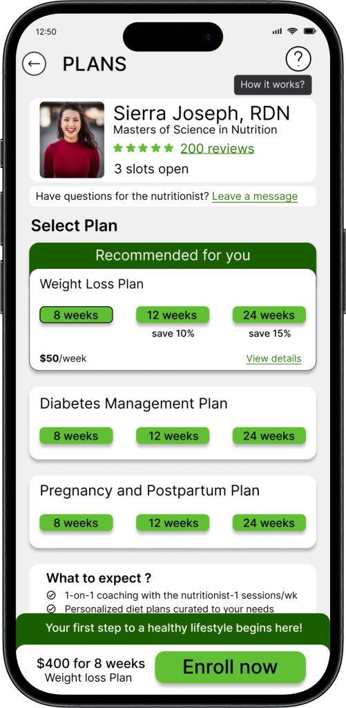
Log In Home Nutritionist list Nutritionist profile Plans Select a plan
Find and select a Nutritionist task flow
Usability testing
In pursuit of understanding my target users, I conducted :
6 remotely moderated tests with participants from various cultural backgrounds, gender, age groups and perspectives on food and health.
I meticulously developed a usability test plan and test script, obtaining consent from all participants and orchestrating remote moderator tests via Zoom video sessions. Utilizing three primary flows, I crafted scenario-based tasks to observe participants' navigation through the prototypes and complete the tasks. Subsequently, I organized all findings and results into Affinity mapping and a Rainbow spreadsheet. From this analysis, I identified 5 major issues and iterated upon the designs to optimize them furtherA/B testing using Lyssna (formerly known as Usability Hub) to determine favored primary color for the app
Results are displayed below in a horizontal scroll through
Iterations
In response to mentor, tutor, and peer input, along with insights from usability testing, I spent 4 weeks iterating on the designs. My primary goal was to elevate the designs to align with WCAG accessibility guidelines and ensure straightforward intuitive navigation across the app. Here are
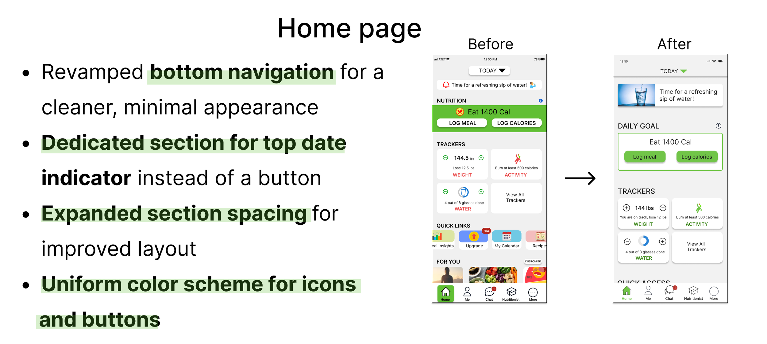
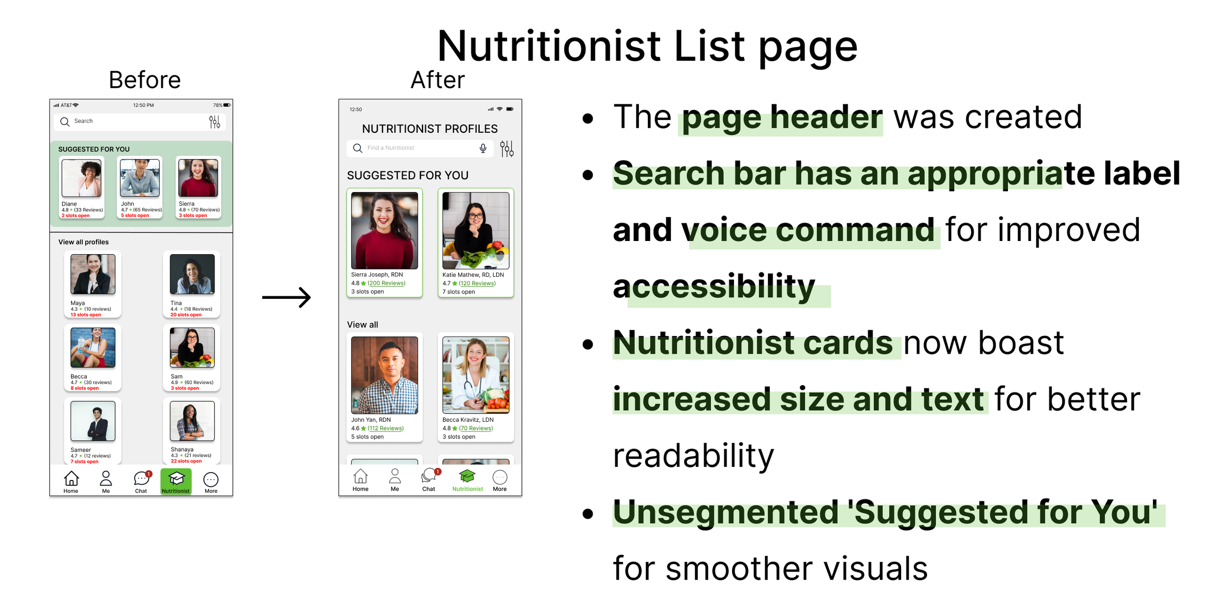
4 major iterations to my designs
For detailed list of iterations please refer to these presentations on design collaboration, polishing the design and designing for accessibility.
The Final design
Clickable prototype - Find and select an expert followed by booking a session
Desktop home screen
Design Document
Typography, color palette, icons, buttons, navigation, UI components, images, responsive grids
presented in a horizontal scroll through

Success Metrics
Success metrics or goals to measure Nutriwise's success post-launch:
User Engagement:
Number of registered users, frequency and duration of app usage as well as active user retention rates.User Satisfaction:
User ratings and reviews on app stores.Task Success:
Successful completion of key tasks (e.g., scheduling sessions, logging meals, tracking daily habits, engaging in communities).Efficiency in navigating the app.Personalization Effectiveness:
Percentage of users receiving personalized meal plans via completed one on one sessions.Retention and Loyalty:
Churn rate (how many users discontinue using the app) and customer lifetime value.Impact on Health Goals:
Progress in users' health and nutrition goals and user-reported improvements in health metrics.Technical Performance:
App performance (loading times, responsiveness).Bug reports and resolutions.Referral and Growth:
Number of users referring the app to others and organic growth in user base.Cost Metrics:
Cost per acquisition (CPA) and return on investment (ROI) for the UX project.Tracking these metrics, will allow assessing the success of the UX project, identifying areas for improvement, and ensuring that the app is effectively meeting the needs of its users while achieving its business goals.
Reflections - What Nutriwise taught me
This is my first project as a UX designer ! Embarking on my project as a solo student UX designer has been exhilarating! Completing this project from its inception to the final product fills me with pride and excitement. Through this journey, I've cultivated growth as a designer, evolved personally, and gained insights as a user. This is what the experience taught me -
User-first approach : The importance of thorough research into user needs, motivations, and pain points as the cornerstone for impactful, intuitive, and comprehensive experiences. It underscored the necessity of prioritizing user needs, steering clear of personal biases in the design process.
Collaboration is key: Collaborating with peers, test participants and friends/family has proven to be vital in gaining valuable insights that optimize design decisions. I am motivated to bring this valuable trait of teamwork, collaboration and keeping effective open lines of communication that I cultivated over my 14+ years of experience as a Physical Therapist into my role as a UX/UI designer
Embracing Feedback: Gathering feedback at every stage of design development was a pivotal lesson learned. I discovered the value of broadening my perspectives and embracing constructive criticism from target users, peers, and mentors. This openness enriched my design process and fostered continuous improvement and broadened my comprehension of various aspects, including accessibility guidelines, design systems, and grid layouts.
Iterate: I've cultivated the skill to step back and gain a larger perspective, conduct user testings, analyze data and iterate on designs using research and valuable feedback. This process aims to craft the optimal product version, even if it entails starting anew from scratch when necessary.
Valuing familiarity: Embracing what's been proven effective and appreciated is a positive stride. I recognize the significance of identifying successful design elements and seamlessly integrate them into my designs.
Next Steps
Ensure all interactive elements are finalized and user-friendly.
Elevate accessibility features with continuous thorough market research and implementing best practices such as pinch to zoom, voiceover and more to cater to a broader user base.
Integrate user testing both before and after iterations, involving both new and existing users to ensure seamless usability and identify areas for improvement
Explore the possibility of incorporating a feature that not only allows users to shop for groceries but also provides the convenience of home deliveries, tailored to their chosen recipes
Conduct competitive analyses and research best practices for desktop version and formulate a plan for the mobile to desktop adaptability
Thank you for reading
I would love to hear your thoughts on my project, collaborate on future projects and work together :) drop a line here


